Phone design is long gone from the days of slider keyboards, touchpads, and physical end-call buttons. Almost all smartphones found in carrier stores today have the same characteristics. There’s a huge battery, a camera module that protrudes significantly from the rest of the frame, and a huge high-resolution display that stretches from edge to edge. without interruption.
Just because all OEMs use the same design philosophy doesn’t mean it’s above reproach. In fact, I’m about to discuss something so controversial that I wouldn’t be surprised if some people just look at the headline and want to jump into the comments. I think modern smartphone design has gone a little too far with how slim the bezels are, or in some cases non-existent. The Galaxy S25 Ultra may look futuristic, but I think we’re moving toward a device that feels downright uncomfortable to use.
History of smartphone bezels
How far have we come and only so much room left to grow?
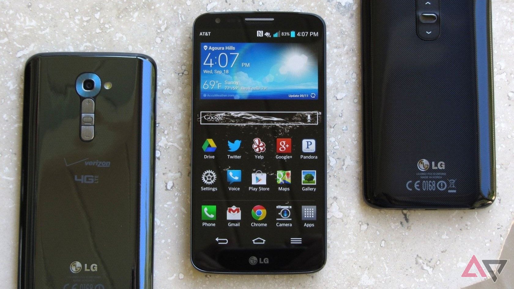
I don’t know when the smartphone industry actually started focusing on bezels. Perhaps it started with the LG G2, which used disproportionate bezels to minimize space along the top and between the display and the sides of the device. It probably started in earnest with Samsung’s Galaxy S6 Edge, one of the first mainstream Android devices to use a curved panel (the Galaxy Note Edge was more of an experiment than anything else). Maybe it was the Essential Phone. Niche appeal aside, it definitely became a hot topic among the enthusiasts among us.
Or maybe the obsession with minimizing the hidden space on the front of our smartphones has always been there, waiting for technology to catch up with our dreams of the future. The LG G2 felt minimalistic at the time, and I’m proud to be a previous owner myself, but thanks to the thick chin along the bottom of the display, it actually looks like it does today. Looks pretty outdated by standards. If a phone came out today with a 75.9% screen-to-body ratio, it would be laughed at by both Reddit threads and carrier stores. Still, this felt like a revolution compared to competitors Galaxy S4’s 72.3%, HTC One M7’s 65%, and iPhone 5s’ 60.8%.
For the better part of the last decade, bezels larger than one around the screen have become a thing of the past. In 2017, the Galaxy S8 and the iPhone It looks old. In 2019, the Galaxy S10 saw further progress with a ratio of 88.3%. Five years later, it’s still a super slim design, even by modern standards.
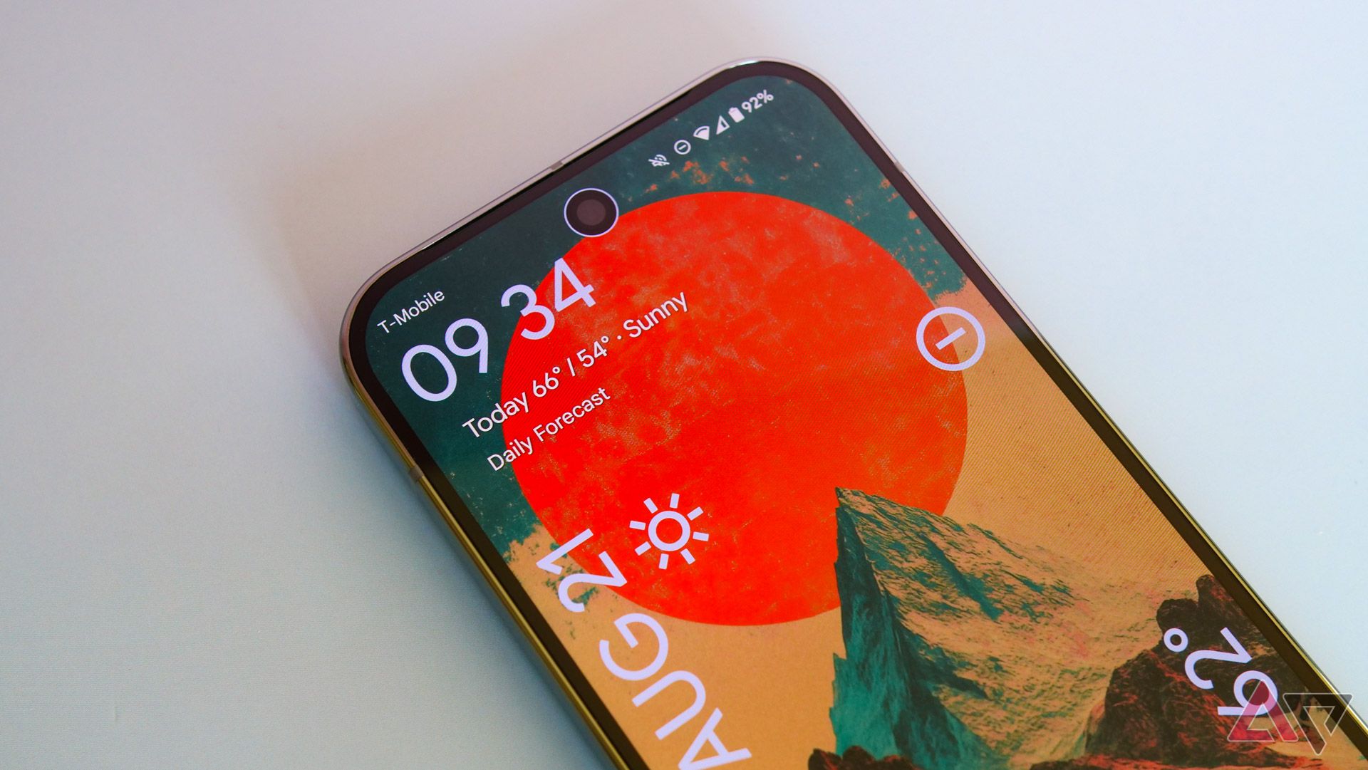
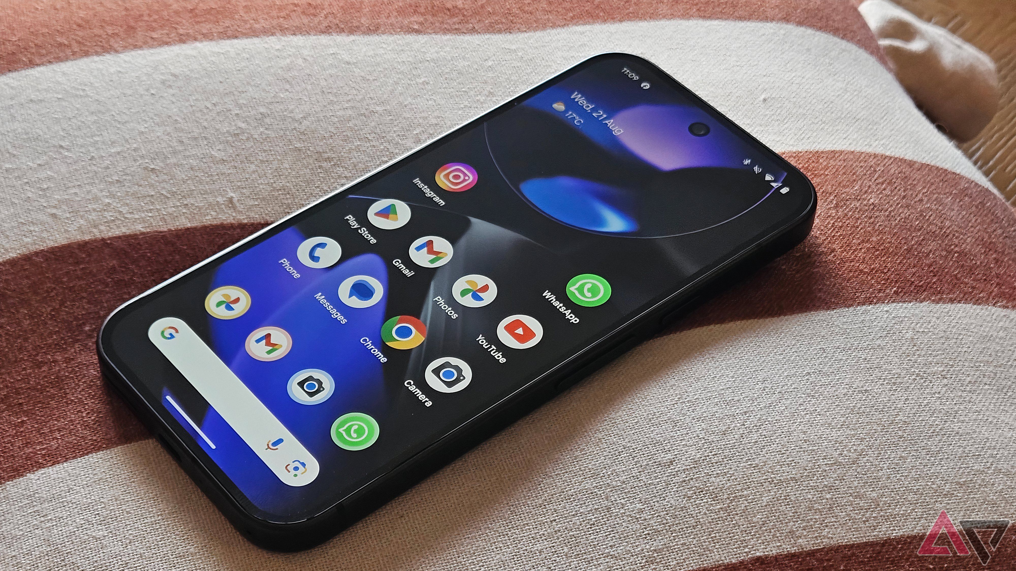
Since reaching this peak, smartphone manufacturers have been slowly trying to cut away the area around the bezels of their devices by millimeters, but we’re not sure if that’s for the best. The Pixel 9 Pro — a front-runner for this year’s best phone — has a screen-to-body ratio of 87.6%, which is what it looks like in the eyes of a particularly picky Redditor. dated. For some enthusiasts online, it’s a waste of time to try to compete if your phone isn’t up to that sacred 90% metric.
For example, the only real design change on this year’s iPhone 16 Pro Max is the bezel. The ratio is 91.4%, which is clearly an impressive achievement. Broadly speaking, you need to look outside the United States to find competitors. Tecno’s Phantom X2 Pro and Motorola’s Edge 50 Pro are both the best of Apple’s latest offerings, despite using partially curved displays. Samsung is clearly trying to outdo the iPhone with the next Galaxy S25 Ultra, and is aiming to introduce even slimmer bezels in its next phablet.
Frankly, I don’t know what it’s for at this point.
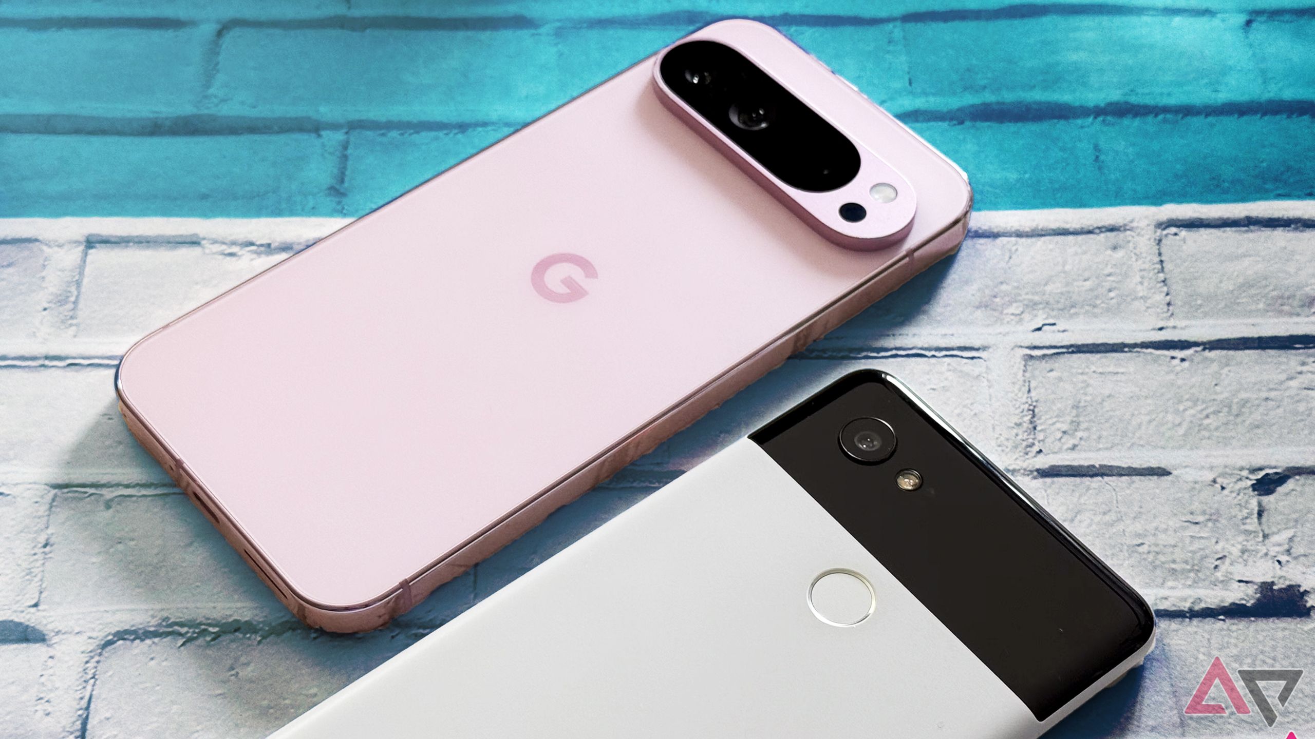
related
If little changes, do you need a new flagship phone every year?
Why incremental updates every year are boring
Bezels serve a purpose beyond mere aesthetics
Mobile phones are practical items, not decorative items.
Look. I’m not here to argue that it’s worth going back to the days of 60% or 70% screen-to-body ratio. Generally speaking, I like the design of modern smartphones, even if they’re a little outdated compared to the wild west of the early ’10s. But over the past few months, I’ve been wondering if I’ve gone too far. This feeling started with the Pixel 8a, of all smartphones.
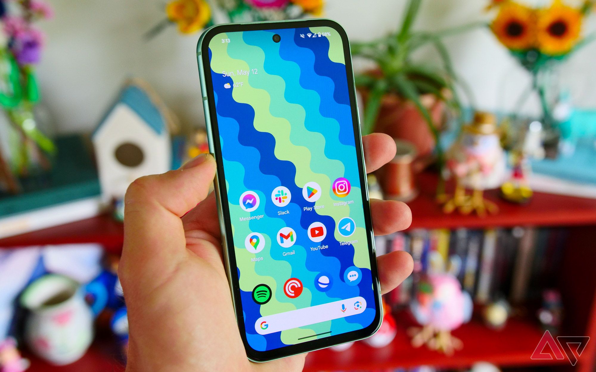
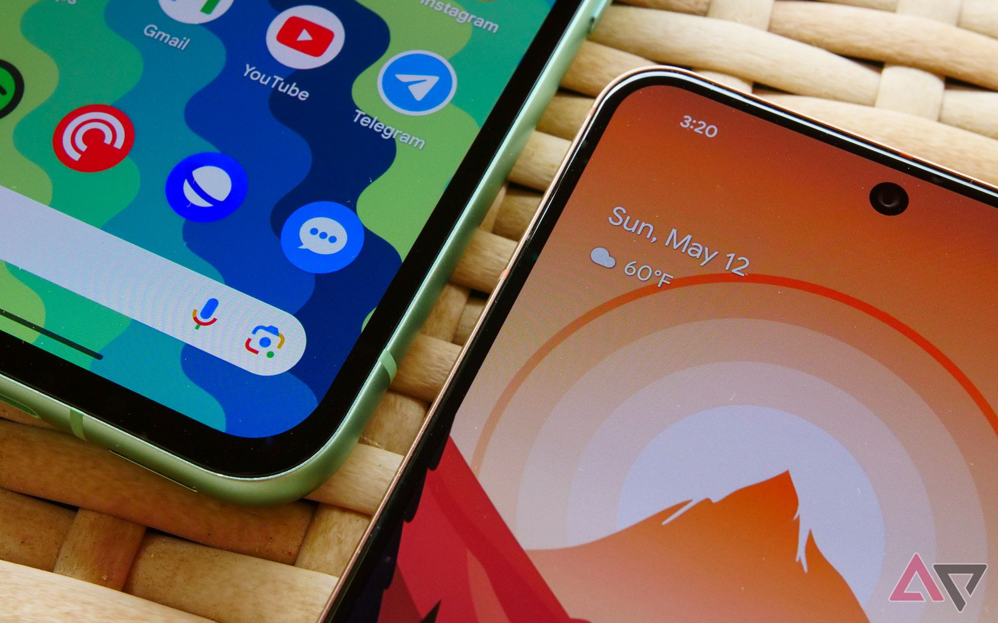
It’s not hard to find criticism of the Pixel 8a’s design online. I even called them “awkward first impressions” in my review. With uneven and relatively thick bezels, it looks like a budget phone, especially when compared to modern flagships. Google hasn’t changed the bezel shape between generations, but the Pixel 8a’s curved corners make it look a little smoother than its predecessor. The ratio is 81.6%, which is a big difference from the near edge-to-edge displays found in phones costing twice as much. And, perhaps most importantly, it’s both taller and wider than the regular Pixel 8, despite using a slightly smaller display.
In our quest to turn every smartphone into an uninterrupted display, I think we’ve forgotten what bezels actually do for us.
However, these bezels have significant advantages. The Pixel 8a is much more comfortable to hold than most of these ultra-slim flagship models, especially when you’re not using a case. Whether you’re texting, browsing the web, or watching a video, Google’s borders give your fingers and palms room to rest without obstructing the display in any way. No more awkwardly pinching your fingers around the frame. Just hold your phone like a phone. And the more I used the Pixel 8a in the months since its release, the more I enjoyed just owning it.
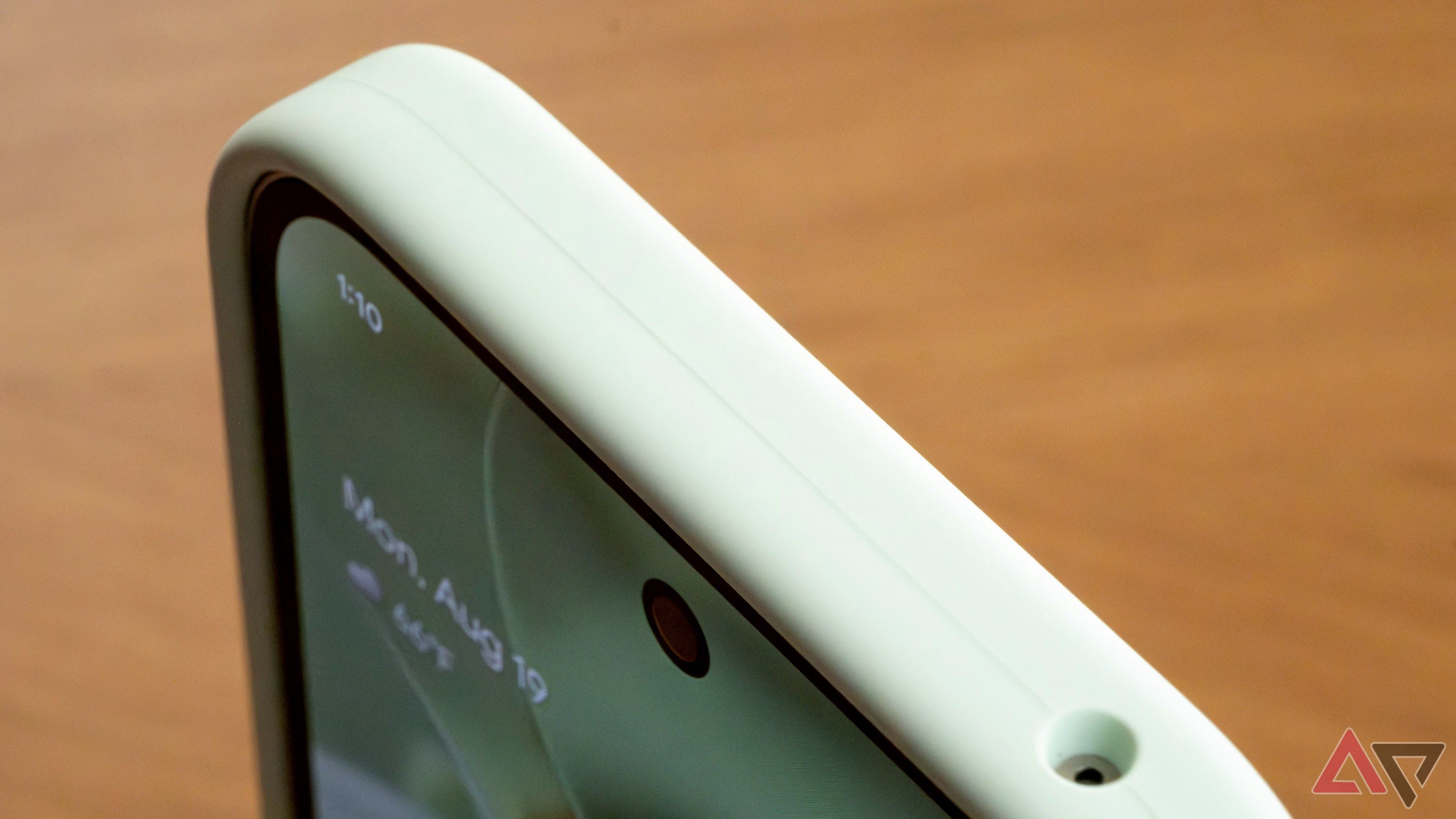
This is a trend that reminds us of the worst aspects of using a cell phone with a curved display, and that without a case that pushes the boundaries, it’s physically difficult to send text messages or play games. You will feel uncomfortable. At the point where you need additional accessories to enjoy holding your phone, you have to suspect you’re dealing with a bad design.
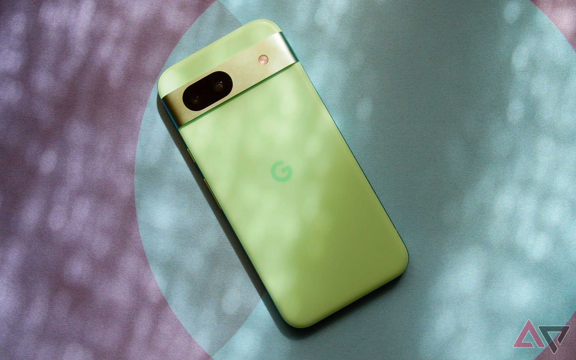
related
Google Pixel 8a review: A great smartphone you don’t know if you should buy
Google’s hardware lineup is in a sticky spot, and the Pixel 8a only confuses things further
Smartphone manufacturers can’t stop chasing this trend
Crossing the Rubicon with mobile phone design
Admittedly, the Pixel 8a may be an extreme case. We can’t complain about the slimmer asymmetrical bottom bezel on the Pixel 9a. But I think the Pixel 9 Pro is the slim borderline of what I want in a smartphone. It’s not just to avoid accidental touches. The more smartphone manufacturers shrink bezels, the harder it becomes for case makers to protect these ultra-expensive devices without covering the sides of the screen. The same goes for screen protectors, which seem to be pretty hit or miss with the iPhone 16 Pro Max, judging by some of the reactions on Reddit.
Phantom Touch seems to be a big deal with Apple’s latest phablets. Some users report that this phone’s touch rejection is too aggressive. This is likely due to tweaks aimed at improving the experience of using a phone with such slim bezels, but other users felt it wasn’t aggressive enough. I am. Again, it’s all in the name of beauty over ease of use.
In our quest to turn every smartphone into an uninterrupted display, I think we’ve forgotten what bezels actually do for us. I think by making the bezels thicker, especially around the top and bottom of the phone, you can create a case that achieves the functionality you’ve sacrificed for aesthetics. To be honest, I sometimes miss front-firing speakers. The earpiece is Are you okay They can be substituted when designing for stereo, but I’m frustrated because I haven’t yet tested a modern device that produces perfectly balanced sound.
The same goes for uninterrupted viewing. Sure, the average YouTube video doesn’t support the selfie camera, but I’m always frustrated when watching movies while traveling and how often parts of the image are missing. You won’t find me complaining about the hole-punch camera in reviews, but I’m also not going to pretend that it’s a positive change to smartphone design.
Extending the display to the entire front of the phone doesn’t make these devices smaller or easier to handle. It’s just that the device is smaller. tall. Look again at the iPhone 16 Pro Max. Apple didn’t achieve the 6.9-inch display just by using bezels. It is several millimeters taller than its 6.7-inch predecessor. what?
We’re at peak bezel and I’d like to stay there
We don’t want to go back to the days of the original Pixel, when most of the smartphone was spent on useless pieces of glass. I think it’s more accurate peak bezelperfect screen-to-body ratio that doesn’t hinder usability, touch rejection is no problem, and accessories work without any problems. I can’t imagine a world where we shrink these ever-expanding displays, just as companies like Apple and Samsung refuse to offer devices with displays smaller than 6 inches, but others like Google We hope that the brand maintains its current policy. .
I’m all for modern smartphone design. I’m all for minimalism, expansive screens, and futuristic-looking devices. But at some point, we wonder if we’re losing far more than we’re gaining. If you’re already over peak bezels, all you need to sacrifice is comfort.


