Rita El Khoury / Android Authority
TL;DR
- Google is working on a redesigned keyboard shortcut menu that’s easier to use on large-screen Android devices like tablets.
- The revamped menu uses side navigation rails instead of tabs at the top, making it easier to access shortcut categories.
- The new menu is not yet available, but it may be rolled out in the upcoming Android 15 QPR1 update.
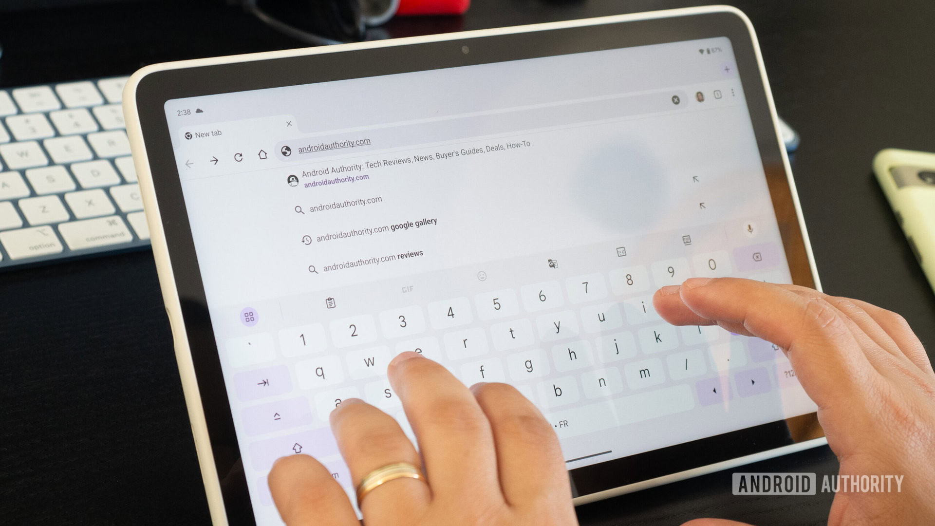
A few years ago, Google set out to improve how Android works on tablets. This begins with the introduction of the taskbar in the 12L update in 2022 and continues with the introduction of major new features such as lock screen widgets and desktop windowing in the upcoming first quarterly platform release (QPR) of Android 15. Google is also working on some features. The first QPR of Android 15 brings small new changes for tablets, the latest of which appears to be a redesigned keyboard shortcut menu.
Android, like most other operating systems, lets you navigate the UI using keyboard shortcuts. Shortcuts include opening the app drawer, going to the home screen, viewing recent apps, going back, and taking a screenshot. In fact, there are so many keyboard shortcuts that Android has a dedicated menu that lists them all. The Keyboard Shortcuts menu also has its own keyboard shortcuts.
Android keyboard shortcut menus have been around for quite some time, but they were always something of an afterthought because Google didn’t previously care as much about Android tablets as they do now. In fact, until Android 14 was released, the keyboard menu showed only 13 shortcuts. Since the release of Android 14, Google has finally updated its keyboard menu with a more comprehensive list. To help you find the right keyboard shortcuts in Android 14, Google organized them into categories and added tabs that you can tap to filter.
However, there was a small issue with Android 14’s keyboard shortcut menu that made it difficult to use on tablets. The problem was that the tabs were placed fairly high towards the center of the screen, making them difficult to reach. This is something that is hard to reach on many tablets. That’s why Google is redesigning the keyboard shortcut menu.
While exploring the latest beta version of Android 15 QPR1, namely Android 15 QPR1 Beta 2, I came across a code that enables the side navigation rail for the keyboard shortcut menu. In case you didn’t know, the side navigation rail is a Material Design component that positions high-priority destinations (in this case, keyboard shortcut categories) to the side for easier access on larger screens. The redesigned keyboard shortcut menu moves shortcut categories closer to the left edge of the display, making it easier to use on tablets. The new keyboard shortcut menu in Android 15 QPR1 Beta 2 looks like this:
Note that this feature is not yet available, so you’ll need to do a little tinkering to enable it. We don’t know when this redesigned keyboard shortcut menu will roll out, but we wouldn’t be surprised if it shows up in the stable Android 15 QPR1 update. It’s great to see Google improving the Android experience on large screen devices with features like this and mouse pointer customization. I hope that there will come a time when Android can compete with traditional desktop operating systems like Windows and macOS. That’s clearly years away, but small changes bring Android one step closer to that dream.

