Robert Triggs / Android Authority
Before I joined Android Authority, the phone in my pocket was entirely up to me. For the better part of a decade, I changed brands each time I bought a new one, going from HTC to LG and later from Apple to Samsung, all because I always wanted to try something new. Then, when I put the Galaxy S10 in my pocket, I decided I might stick around for a while. It was such a monumental change from the tiny, inflexible iPhone 7 that I figured I might be a Samsung fan for life — right up until I smashed it into the sidewalk while out for a run. Suddenly, I had the choice to either pay a hefty repair bill or scratch my itch to try something new once again. I headed to Best Buy, grabbed the Google Pixel 5, and haven’t looked back since.
If I had to make that decision all over again, I think I’d make the same one, and here’s why:
Google’s designs are just more fun
Robert Triggs / Android Authority
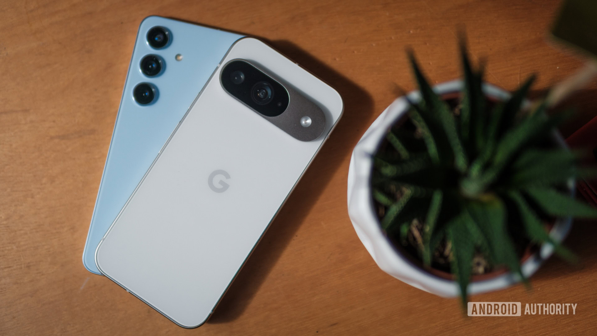
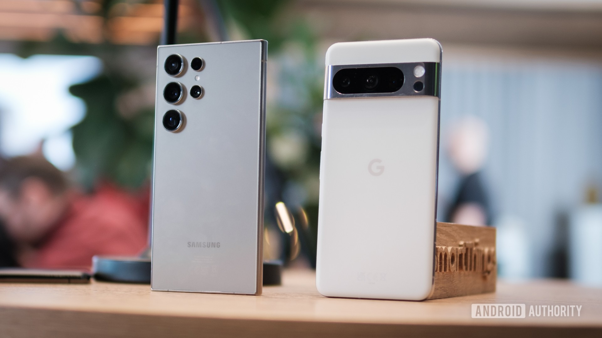
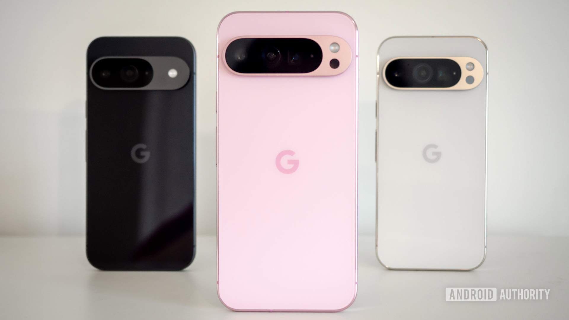
In the grand scheme of things, a phone’s appearance is probably the last reason to buy it. After all, you’ll spend more time looking at its display than its camera bump or whichever colorful finish you carefully selected — especially if you put it in a case. However, I can’t help but judge a book by its cover. If you give me one phone that looks ready for a meeting in a boardroom and another that looks like a character from Star Trek, I will reach for the latter every time. As you might have guessed, Samsung’s current crop of Galaxy devices is the former, while every Pixel since the Pixel 6 Pro is the latter.
Of course, it wasn’t always this way. I liked the Galaxy S10 so much because it felt quirky and different — kind of like a modern Pixel. Samsung stretched its trio of cameras horizontally across the rear glass, selected colorful finishes that would change based on the lighting, and even offered a porcelain version if you were willing to spend a little more. It was so opposite of everything I’d gotten used to on the iPhone 7 that I sat down and ordered mine while out at a bar with friends in college.
Now, just about every piece of that quirky design is gone. Samsung’s horizontal strip of cameras has become a dull set of cutouts in the corner, its optional porcelain has become Gorilla Glass — albeit excellent Gorilla Glass — and its slimming waterfall display has become a flat, smooth panel (which is a good thing, actually).
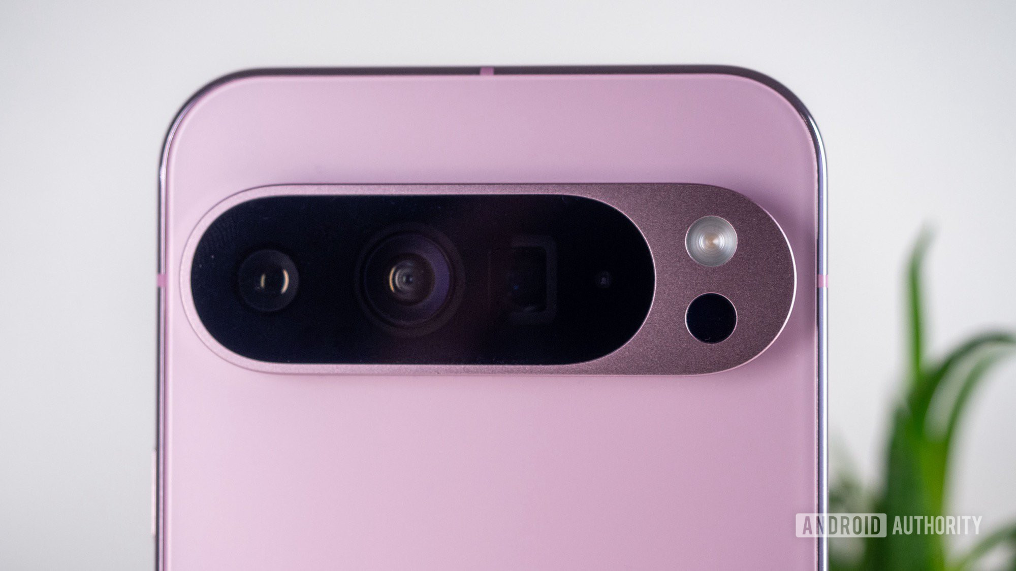
Google, on the other hand, took its Pixel design through an opposite journey. It began with a simple, straightforward camera bump in the top left corner of its first five generations, only to ditch it in favor of a now-iconic camera bar I’ve loved since day one. The split created by the camera bar opened the door for Google to reintroduce two-toned finishes, a choice that made the Pixel 6 and Pixel 7 series feel both fresh and fun. Google’s styling has since evolved again, swapping the visor-like camera bar for more of a camera island that feels both more durable and more mature to match its ninth-generation flagships — even if it’s not aesthetically as much fun.
Perhaps more importantly, Google has raised its build quality to match its more refined design. Its aluminum frames, whether glossy or satin, feel excellent in hand, and they offer just enough of a curve on the front and back so you can reach across the display without accidental presses. I compared the Pixel 9 Pro XL to my favorite iPhone ever, and I’ll stand by the fact that it feels as sturdy and reliable as Android’s biggest competitor.
Google’s build quality gets better every year while Samsung’s designs get simpler and simpler.
Also, I know that looks aren’t everything when you’re buying a phone. With that in mind, I’d still give Google the advantage. When I reviewed the Galaxy S24 Ultra back in early 2024, I barely used the S Pen. In doing so, I was essentially ignoring one of the critical pieces of the phone’s design — a feature that everything else was pretty much centered around. After all, the flat top and bottom edges, the massive body of the phone, and the relatively sharp corners are all there to ensure the built-in stylus has enough room to operate without squeezing the battery capacity or rearranging the camera setup. Unfortunately, the result is a giant, powerful phone that just feels like too much for me to use — let alone stuff into a pocket.
Google, on the other hand, has completely won my heart with its smaller Pixel 9 Pro. It’s everything I waited for in a relatively small Android phone, packing a pro-level battery and a trio of powerful cameras into a device the same size as the base Pixel 9. Factor in Google’s rounded corners and gently curved frame, and it feels even smaller in the hand, which is great news for me. The Pixel 9 Pro is pretty much equipped to compete with the Galaxy S24 Plus but is sized like the Galaxy S24, which brings back fond memories of toting around the Pixel 5 back in the day.
One UI is customizable but a little overwhelming
Ryan Haines / Android Authority
It’s not just Google’s hardware that I prefer, either — I’ll take Pixel UI over One UI whenever I’m given the chance. One of the first things I do when switching to a Samsung device for an extended period is to swap from its default One UI launcher to Lawnchair, simply because it makes me feel more like I’m still on a Pixel device. I’m not alone in my preference for Google’s light, clean (but not stock) Android experience, either — my colleagues agreed when we put Pixel UI atop our ranking of the best Android skins on the market. Don’t get me wrong, we put Samsung’s One UI in second place, but the two experiences are as different as can be.
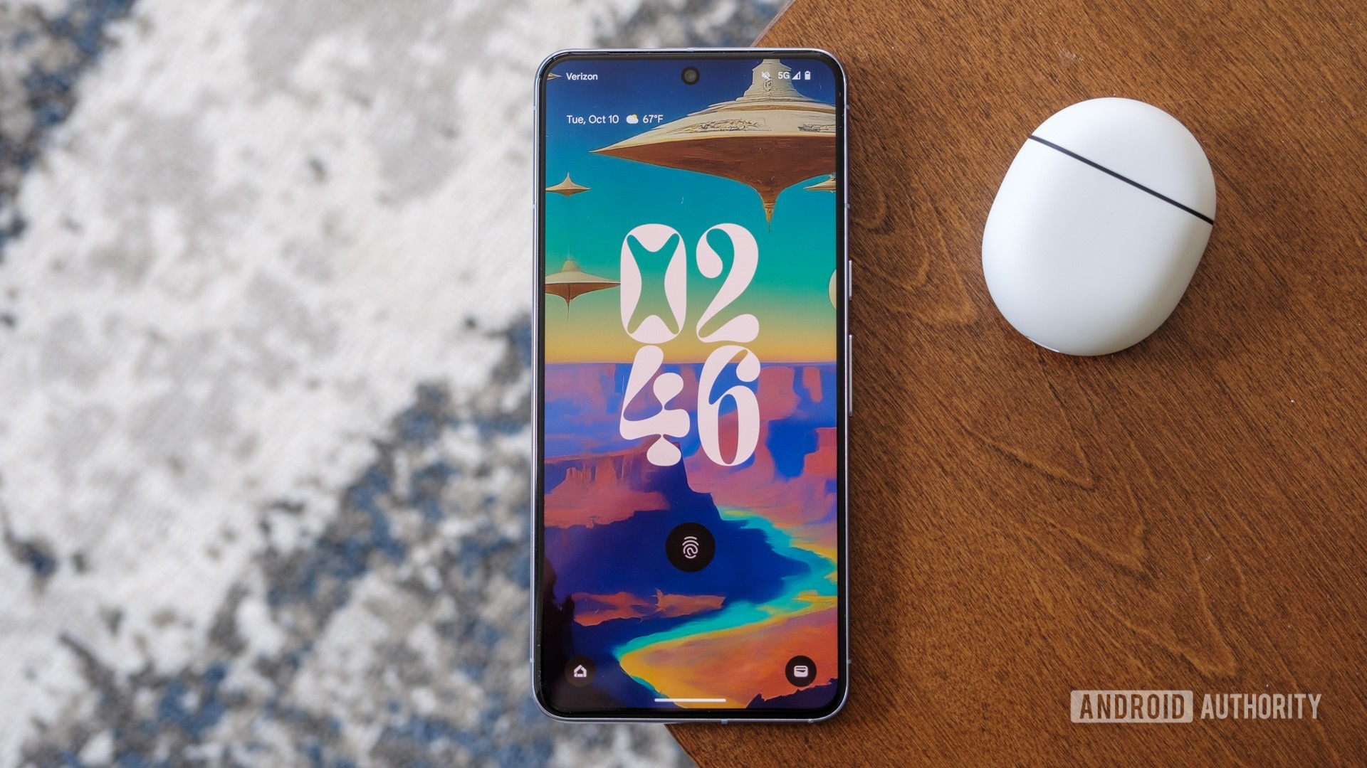
I like that Google’s software design follows its hardware — it’s quirky, colorful, and customizable enough without feeling overwhelming. When I jump into a new Pixel, I know I can easily set it up just as I’m used to, with an app drawer organized alphabetically, apps that color-coordinate to my wallpaper, and a lock screen that features several interchangeable clocks. And yes, maybe that sounds simple, but I’ve never been one to overcomplicate my personal device. I would much rather know where everything is and that it works when I expect it to than dig through a mountain of menus to build a perfect routine for every situation.
On top of that, Pixel UI is Google all the way down. What I mean is that there’s no bloat, no unnecessary duplicates (lookin’ at you, Samsung Messages and Samsung Internet), and all of the widgets default to in-house apps like Google Photos and Pixel Weather. Basically, it means I don’t have to think about much beyond which apps I want on my home screen and which widgets I will use. In some ways, that probably makes me sound like I’d be an iPhone user in another life, and maybe that’s true. However, Apple’s current level of customization leaves a lot to be desired, especially when you color-match your app icons only to find out that they’re almost invisible against the default dark gray background.
Pixel UI takes care of the ‘smart’ and just lets me enjoy my phone.
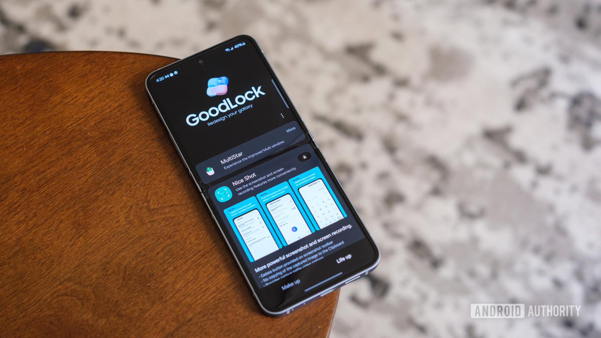
On the other hand, one UI would rather give me granular control over every little piece of my layout. It has a nearly infinite web of settings menus, multiple app stores, and experimental features tucked away under the Samsung Labs menu. You can even download Good Lock to add more wrinkles and complications to your Galaxy device, including the ability to open more apps on the cover screen of the Galaxy Z Flip 6. It’s enough to make your head spin, which isn’t what I want when I change phones and redo the process every few weeks.
Granted, some people will love the chance to make their Galaxy phone feel more like their own. I know a few Android fans who swear by different launchers and have tuned their phones to the point where I barely know how to use them for the first few minutes, but it’s just not the experience for me. I’d rather have everything I need come on my phone by default than download an app and reference a guide I wrote a year prior to make my $1,000 flip phone compete with another device like the Motorola Razr Plus.
Ryan Haines / Android Authority
Oh, and then there’s the bloatware. I hinted at it by mentioning that Samsung has a few duplicate apps, but it also slaps you with several others like Global Goals, Galaxy Wearable (which you won’t need if you don’t have a Galaxy Watch or Galaxy Ring), and a business suite of LinkedIn, Microsoft 365, and OneDrive. Maybe they’re helpful for some people, but I’d rather opt into them than delete them after setup. Of Samsung’s social extras, I only kept Spotify but immediately ditched both Facebook and Netflix.
To Samsung’s credit, though, it matches Google in terms of flagship updates, offering seven years of support across both the Galaxy S24 series and Galaxy Z Flip and Fold 6. So, if you prefer Samsung’s flavor of Android, at least you’ll be able to keep it current long after you’ve paid your device off.
I’ve always preferred Google’s image processing
Rita El Khoury / Android Authority
What brought me from Samsung to Google for the first time had nothing to do with the design of either phone. It didn’t have to do with what the widgets looked like or where I could put them, either. Instead, I was drawn in because of Google’s fire-and-forget camera setup. It didn’t need you to be an expert in camera settings, nor did it need to give you three camera sensors to play with, you just lined up your shot, pressed the button, and let Google do the rest. For years, that processing was enough to keep the Pixel camera among the best you could get on an Android phone. That’s how a smartphone camera should be: Let me capture the moment, but let me keep going while I do so.
Honestly, shooting a photo with the Google Pixel 9 or Samsung Galaxy S24 is like a small reflection of the overall experience. Google will give you a little guidance in helping you level your shot or trace from dot to dot when taking a panorama, but then it lets the Tensor G4 take over. It’ll correct your colors, apply motion effects like long exposure, or pick out elements it thinks you might want to erase, all without you lifting a finger. It’s a significant evolution over the experience I first had with the Pixel 5, yet I can see traces of what Google has been building over the years.
On the other hand, Samsung has always leaned heavily on manual control, letting you fine-tune everything from your exposure to your white balance to your shutter speed before you snap a photo. In some ways, this is closer to the experience you’d get on a mirrorless camera, but it can also take some of the punch out of Samsung’s powerful sensors if you’re not entirely comfortable with the exposure triangle.
Perhaps the best way to explain the difference between using a Google Pixel camera and a Samsung Galaxy camera is to tell people to head out and use their respective astrophotography features. Last summer, my dad put his Galaxy S21 Ultra up against my Pixel 7 Pro, and only one of us came away genuinely impressed. We both walked out to the middle of the same dark field and pointed our cameras at the same starry night, but all I had to do to capture the sky was press my shutter button and wait. He, on the other hand, had to head to Expert RAW, open another menu for Astrophotography, and select the duration of his exposure before he could prop his phone up and hope for the best. His final result was good, but I’m not sure everyone would be as willing to jump through the same hoops.
Samsung makes great phones, but Google’s are better for me
Robert Triggs / Android Authority
Sometimes, when people want to say that they don’t like something without explicitly saying so, they’ll go, “It’s not bad, just different.” I would say the same about Samsung’s current crop of Galaxy devices, but this time, I mean it. There’s a lot to like about buying a Samsung Galaxy device, from the incredibly durable materials to the infinitely customizable software to the powerful, manually controlled cameras. I’d argue that any one of those things is reason enough to spend your money with Samsung, and it’s all enough to make the Galaxy S24 series one of the best Android phones on the market. However, the sum of those parts doesn’t give me the Android experience that I like best.
Instead, I’d rather have Google’s quirky, colorful, occasionally flawed Pixel experience. I don’t mind letting my phone do the thinking for me because Google and I are on the same wavelength about when to use my phone and when to leave it in my pocket. I’d happily take a warmer, slightly less powerful Tensor chip if it meant I’d have Google’s no-brainer image processing. Give me Gemini over Bixby, Chrome over Samsung Internet, and aluminum over titanium because I like the way that they all add up. I want my phone to feel like a piece of technology that I enjoy rather than a tool that I simply use in my day-to-day life.
Of course, I haven’t had to buy a phone in a long time. As a reviewer, they just show up at my door every so often, giving me a chance to jump from one to the next and stay on top of all of the US-based flavors of Android. It means that even though my own money isn’t behind either Google or Samsung (or Motorola or OnePlus, for that matter), my experiences certainly are. I’ve had hands-on experience with things I like and don’t like from every major brand, and I’ve had the freedom to change between them at any time. But, despite all that freedom, I just keep coming back to the comfort of a Google Pixel — and I keep telling my friends and family members to do the same.
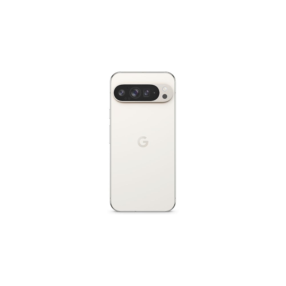
Google Pixel 9 Pro XL
The best specs in the Pixel 9 series
Gorgeous display
Seven years of software updates
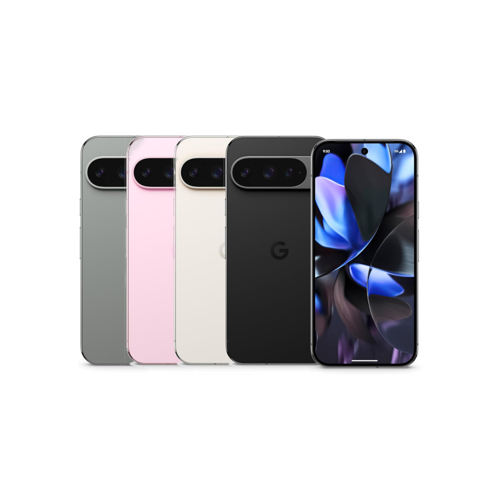
Google Pixel 9 Pro
Impressive AI-powered features
Excellent build quality
Flexible, capable cameras
Reliable update commitment
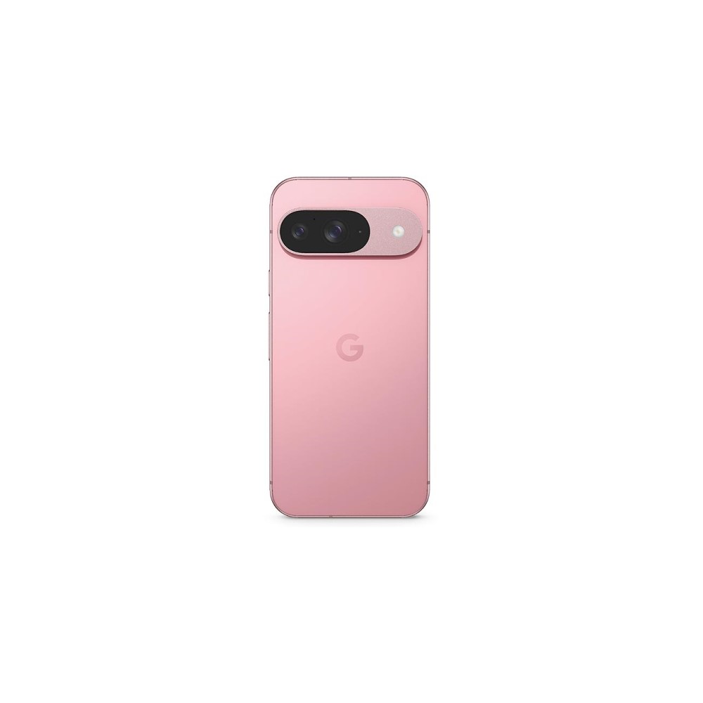
Google Pixel 9
Powerful Gemini AI tools
Excellent build quality, refined design
Extensive update policy
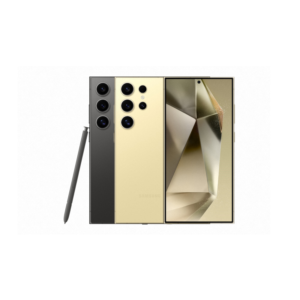
Samsung Galaxy S24 Ultra
Powerful, flexible cameras
Excellent update commitment
Brilliant flat display
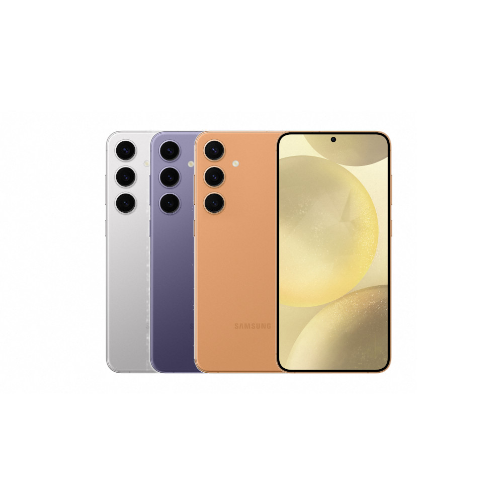
Samsung Galaxy S24 Plus
Bright, sharp 1440p display
Excellent update commitment
Handy Galaxy AI features
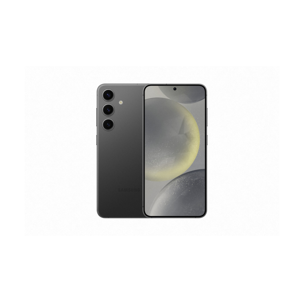
Samsung Galaxy S24
Seven-year update commitment
Neat AI features
Robust battery life

