Over the past few generations, the iPhone has gone through several design changes. Aesthetic changes are inevitable, but new additions often raise questions.
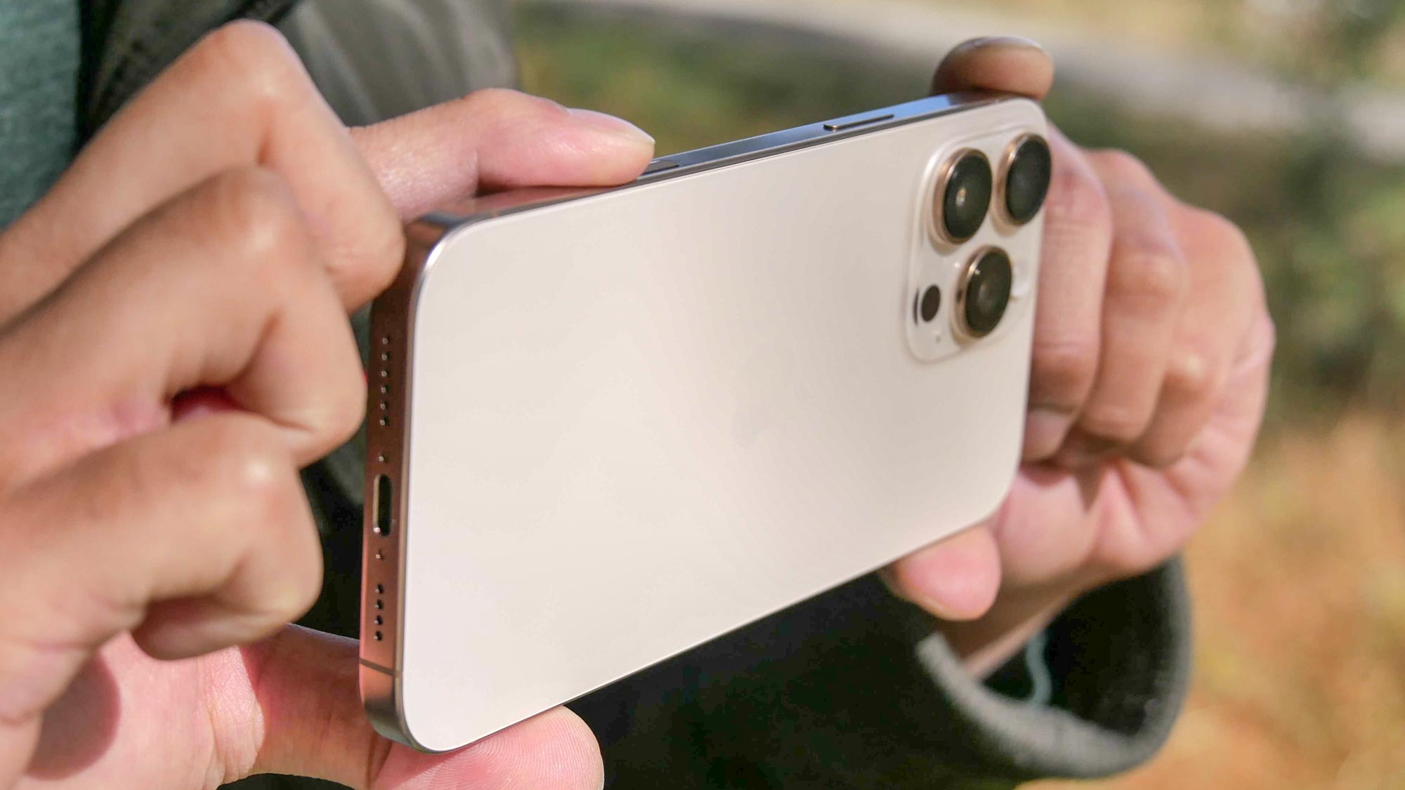
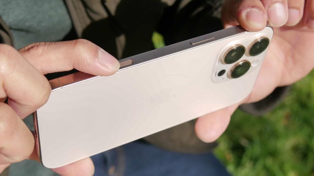
In 2023 alone, the iPhone 15 Pro introduced an action button and a titanium frame. And this year, it added camera control buttons, perhaps the biggest physical addition to the iPhone design in years. Apple definitely put the spotlight on this new “button” during the Glowtime event, giving users a new way to quickly access its most popular features.
I used this new feature on my iPhone 16 Pro Max last month to better understand what it has to offer, and to see if it’s overrated or underrated. I’ve been doing it. So what do you think about camera control? Well, let’s just hope Android phone manufacturers don’t copy it.
Doesn’t improve workflow

Whenever Apple introduces something new, I scrutinize those changes to see if they have any practical impact on my workflow. I’m no stranger to working with professional cameras (Panasonic Lumix S5 to be exact), so I was hoping that the camera control buttons would streamline my workflow, but that’s not really the case.
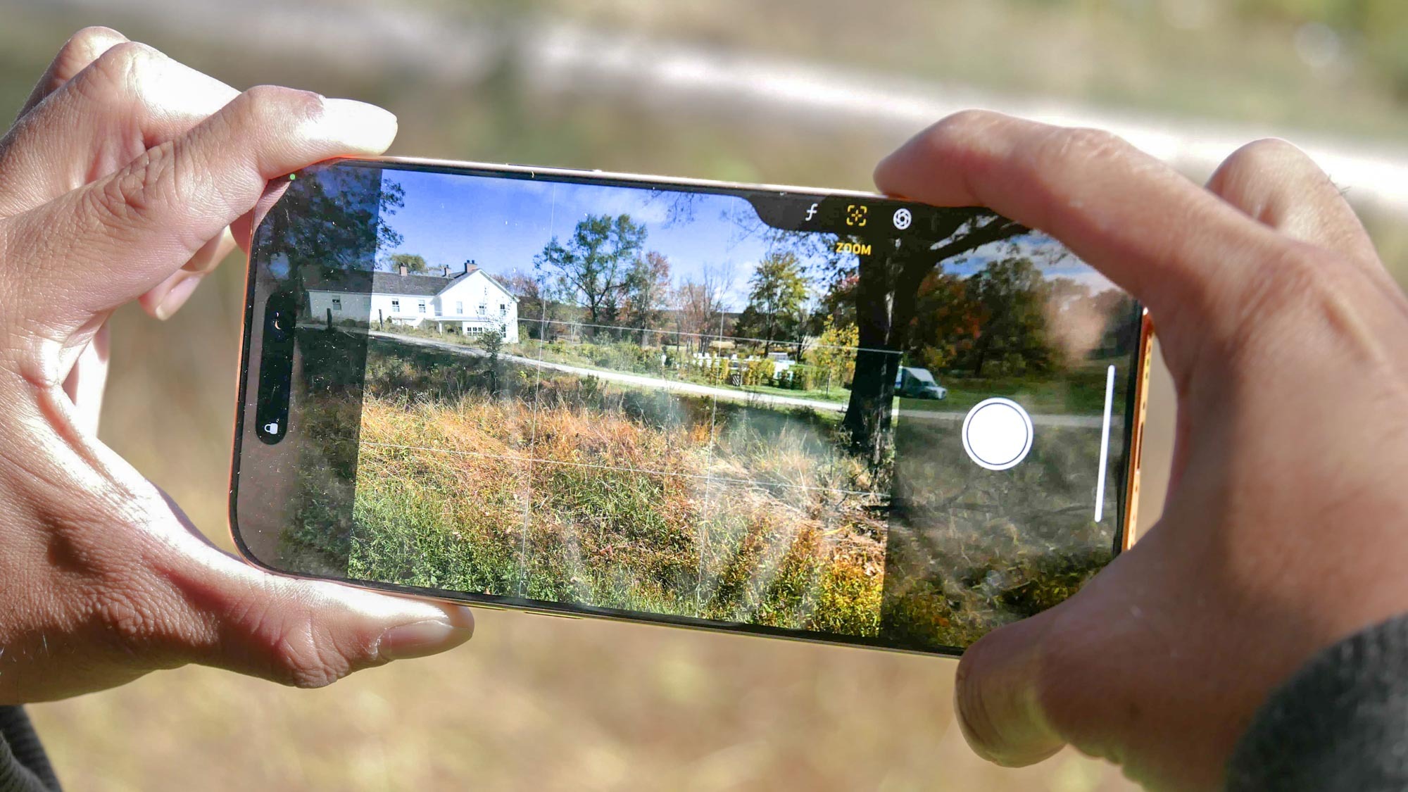
Frankly, the camera control button is just another way to access all the features within the camera app, and it can be done with just a few taps. This is what I would classify as a glorified quick access button. And I admit that it does that by launching the camera app with a quick press. But more than that, I found the camera controls to be less intuitive for more control over the camera’s features.
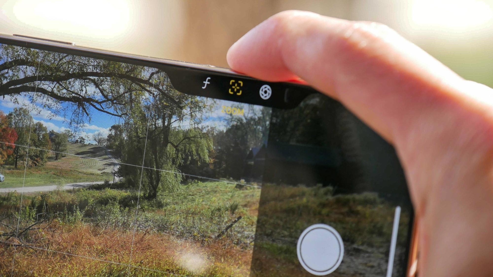
For example, the camera control I use most often is zoom. It feels like you have to constantly swipe the camera control button to zoom a photo from 1x to the maximum of 25x. I timed it myself to see if it was faster than relying on good old pinch-zoom with my fingers. guess what? Camera control is quite slow.
The same goes for all other features such as exposure adjustment, pseudo aperture control, and style. All of these settings and options can be quickly accessed directly from the camera’s interface, which I found to be much faster than using the camera controls. And let’s not even get into why Apple decided to have a “camera” option. Basically, it offers the same zoom toggle options (0.5x, 1x, 2x, 5x) that you have on the camera’s interface.
All options are complicated

I’m still confused about the action to switch modes in Camera Control. In my opinion, the double press action feels awkward, especially when switching from one button to another. That only adds complexity and goes against the core principles of iPhone. Instead, it should be intuitive.
I understand that Apple wants to give iPhone 16 users quick access to these features, but double presses and swipes complicate everything, and in the end, one or two of the camera control options… I can guarantee you that you will end up using one. At most.
From the moment it was announced, I immediately associated the camera control buttons with the knobs you often find on the end of professional cameras. In fact, there are usually two. One for shutter control and one for aperture.
To me, a better implementation would be the ability to lock the swipe gesture with the camera control button to one specific function and switch between them through the camera’s interface. Perhaps there could be some sort of scroll wheel that effectively toggles between all existing options? In any case, the button is just a reinvention of the wheel.
Control everything but no real control

It comes down to control, right? That’s the premise behind the iPhone 16’s camera control button, but as a self-confident photographer, it doesn’t really help me. What Camera Control lacks is the ability to customize it. I assume That’s what action buttons are for. However, I prefer to focus on camera-specific features.
One of my favorite examples is that you can customize the camera control button to take a burst of photos when pressed or act as a gif animation creator (similar to what Samsung phones do). I don’t have high hopes for the camera control buttons, but the current version is over-hyped.
What about Android phones? This is one of Apple’s trends and there’s no need to copy it.


